24 September 2009

No more slidesters, part 1: The wrong tool for the job

Many people have discussed the deficiencies of “sliduments”: PowerPoint printouts that are given instead of actual, detailed prose documents. See also here.

PowerPoint logoAnother misuse of PowerPoint is to use it to create large posters. My experience has been that PowerPoint is abysmally suited for this task. That said, I have not used the 2007 version of PowerPoint that was released along with Windows Vista, but I have suspicions that at least some of the problems I had are still true. The main reason I suspect this is that I deal with posters for HESTEC from our department every year for the last four. And every year I am horrified by the PowerPoint posters. People only do this because they know PowerPoint and think it’s “good enough” for the task. My reaction is much like that of William T. Riker: “‘Good enough’ never is.”

In the last version, PowerPoint was limited in how big a poster it can make (56 inches, according to here). Some conferences give several feet of space, and PowerPoint couldn't reach the large sizes.

PowerPoint is also wretched at typesetting and handling complex layouts. It’s harder to change even basic paragraph settings like line spacing in PowerPoint than Word. Perhaps the fatal flaw is that the heart of any poster layout should be a consistent grid, and setting up a grid in PowerPoint is very difficult. Consequently, I see many posters where I’m willing to bet that no two items on them are actually aligned. They’ve been roughly kinda sorta eyeballed.

Yet using PowerPoint is so entrenched for making posters that printers provide PowerPoint templates for clients and actually encourage the abominable practice.

Strangely, many who use PowerPoint have an much superior tool at their disposal: Publisher. It’s part of the standard Microsoft Office package, but not many people are aware of it. It uses many of the same commands and logic as the other Office software that people know, so its lack of popularity is all the more surprising. Publisher has its limitations, but the improvement over what one can do in PowerPoint is huge.

(Original version posted at NeuroDojo.)

17 September 2009

Containment

Posters have to be self-contained, in two senses of the word. This is a major difference between posters and slides.

EcosphereFirst, you only have a single canvas for a poster. Everything has to fit within that space. In contrast, it’s rare to have only one slide. Slides are gregarious things, preferring to appear in swarms. With digital slides now the norm, you effectively have infinite space (even though you see only one small section at a time).

Second, posters should be understandable when the presenter isn’t there to explain it. Slides are almost always intended to accompany a speaker, and explicitly serve as aids to a presentation. You never walk into a room at a conference where there’s just a series of projectors, with slides flicking by on auto advance.

Thus, a poster will always have more elements to consider than any one slide. This presents a bigger challenge to layout, and causes greater planning demands.

One of the biggest struggles in designing a poster is to decide how much can be removed without making it impossible for someone to understand the poster when the presenter isn’t around. Unfortunately, there are no easy rules of thumb to follow.

10 September 2009

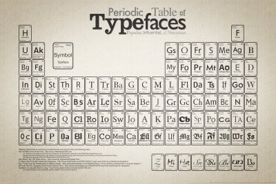
Periodic table of typefaces

Periodic Table of Typefaces
This graphic puts a large number of fonts “at a glance.” Mimicking the periodic table of the elements is an interesting idea, although it’s more a gimmick than anything useful, unlike the periodic table of the elements, which reflects nature.

Found in the article, 40 Useful and Creative Infographics at Six Revisions. Many of the other graphs are worth looking at, particularly for the use of colour and the integration of text and graphics. Many may be too dense for posters, however.

03 September 2009

No need to shout

As a scientist, I have to keep up with journals in my research field. For most journals, I get an RSS feed with the title and abstracts of journal articles. There is one journal, however, for which I respect the science, but hate their feed. Because they set all of their article titles in all capital letters:

ShoutHOW TO PREVENT CHEATING: A DIGESTIVE SPECIALIZATION TIES MUTUALISTIC PLANT-ANTS TO THEIR ANT-PLANT PARTNERS
EXTREME HOST PLANT CONSERVATISM DURING AT LEAST 20 MILLION YEARS OF HOST PLANT PURSUIT BY OAK GALLWASPS
GENETIC ARCHITECTURE FOR THE ADAPTIVE ORIGIN OF ANNUAL WILD RICE, ORYZA NIVARA
GENETIC DISTANCE BETWEEN SPECIES PREDICTS NOVEL TRAIT EXPRESSION IN THEIR HYBRIDS

Admit it, you didn’t read any of those. You skipped here to pick up the conversational thread, didn’t you? (In fairness, it’s not quite as bad in the RSS reader as they appear here, because there is a little space between entries in the reader.)

When I look at those article titles, I can feel my brain “gearing down” every time. Reading slows to a crawl. The experience drives me nuts. When I’m looking at the feed, most entries are irrelevant to me, so I skim, doing a quick search for topics that interest me.

And that is exactly the same situation I’m in during a poster presentation session. Yet many people insist on setting their poster titles in ALL CAPITAL LETTERS.

Compare the experience of reading this to the above. The titles are the same, and much could be done to improve the distinction between each title. Even so, just setting them in regular sentence case makes them they less likely to cause someone to skip over them immediately.

How to prevent cheating: A digestive specialization ties mutualistic plant-ants to their ant-plant partners
Extreme host plant conservatism during at least 20 million years of host plant pursuit by oak gallwasps
Genetic architecture for the adaptive origin of annual wild rice, Oryza nivara
Genetic distance between species predicts novel trait expression in their hybrids

Putting long sequences of test in all capital letters looks like you’re shouting. It’s as unpleasant an experience in type as it is in person.

If you are clear, you don’t have to be loud.

Related links

Questions About All Caps Setting, 29 September 2009, FontFeed blog.

01 September 2009

Type crimes: Accidental sentences

In the last post, I talked about the power of proximity in structuring text and guiding readers through the text. Here’s an example of where that power of proximity has (unintentionally) been used for evil – or at least amusement – rather than good.


From Failblog.

A tiny little line is meant to divide the text to make it clear, but the proximity of the words overpowers it and rearranges two movies titles into one new sentence.

Here’s another example.