31 March 2016

Link roundup for March 2016

I have to lead with Jeremy Fox on the Dynamic Ecology blog, which tells you a big mistake almost every poster makes:


The post actually said too much text, but you get the point. (And thanks for the plug for the blog, Jeremy! Hat tip to Meghan Duffy and Pat Schloss.)

Steven Heard delves into a topic we’ve discussed on the blog before: should you give a poster or a talk?

I think the poster option is underappreciated. Because talks are seen as the default, and because they’re easier to prepare, it’s easy to slip into preferring talks without thinking carefully about the advantages and disadvantages of each format. There are major advantages to posters – especially the very high quality of one-on-one interactions they can bring – and casually defaulting to “talk” blocks off opportunities.

Steven has conferences on the brain this month, as he also wrote about how he tackles conferences as a introvert:

I like all kinds of people – one or two at a time. No matter how much I enjoy seeing my colleagues and friends, I find large quantities of them exhausting.

Ellen Lupton has a free class on poster design up at Skillshare. You need to register, but that’s all. I did so and enjoyed it a lot. If you take the class, you’re asked to design a movie poster. The student gallery is quite fun. Hat tip to, um, Ellen Lupton.

The trick of posters is to take often complex things and present them in a simple way. Brains have a reputation for being complex, so how can they be represented simply? A nice article in Nature Methods applies design to neural circuits. The figure below shows a principle (show different connections use different arrows or different colours, but not both), and a before and after critique:


Hat tip to Adam Calhoun.

David Robinson offers alternatives to pie charts.

 
It’s a lengthy post that is probably helpful if you are fluent in the R statistics package. (I am not, so can’t judge.) Hat tip to Michael Hoffman.

As a biologist, I’ve seen this picture of DNA many times:


What I hadn’t realized until Kindra Crick tweeted it was that this iconic scientific image was drawn by the late Odile Crick, who mostly painted nudes. It was uncredited in the original Watson and Crick paper. Like Jane Richardson (who I mentioned last month), her contribution deserves to be better known. Again, it’s a reminder that good visualizations take some skill that not everyone has, and the impact a good visual can have is enormous.

Here’s how Twitter creates its visual style. Can you articulate a style for your poster as clearly?

Today’s lesson in the importance of typography.


Hat tip to Mark Fidelman and Nancy Duarte.

And now for something completely different: a television series recommendation. While you’ve been watching Netflix original series like Daredevil or House of Cards, this one might have escaped your attention because it’s a foreign language series (Japanese).


Atelier is just a lovely series about beauty, design, craft, professionalism, and mentoring: themes that often appear on this blog. It’s subtle, often funny, and so well observed.


Oh yes, and there’s a lot of lingerie. So it’s a little more visually interesting than academia. Recommended.

(I know, lingerie shows up on this blog more often than one might expect. But it’s not always my fault!)

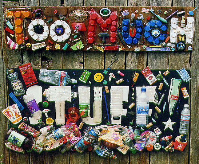
“Too much stuff” image from here.

24 March 2016

Lessons from Skin Wars: Have a focal point


I’ve been catching up with a show called Skin Wars on Hulu (new season coming on Game Show Network in April). It’s a competition reality show along the lines of Project Runway, Top Chef, and FaceOff: make something really cool, really fast. The cool thing they’re making in this case is body painting.

While watching the show, the judges often criticize a painting for not having a focal point. The artists make very intricate paintings, but when you step back, it’s all a confused mess. Nothing stands out.

I often see this with posters. Because posters tend to include way too much text, everything tends to turn into a uniform gray. Graphs tend to look alike.There’s few things that demand attention.

For instance, here’s a painting with no focal point:


Here’s another example of a painting, by Kadinsky, but this time with a clear focal point:


I’m willing to bet the thing that pops out is the dark circle in the upper left.

The reason is that the dark circle stands in contrast to most of the rest of the painting, which is light and has lots of straight lines and angles. Here’s another example of contrast being used to create a focal point:


It’s a contrasting colour, but a contrasting shape would work too. Imagine an unripened banana in the place of the red apple in the picture above. You’d still look more at the banana, because it is different.

Another simple way to create a focal point is with that most underused tool, white space:


There are lots of blue circles on the page, but the one surrounded by lots of white space is emphasized.

A third way to create a focal point is with lines:


Thanks to perspective, the strong lines of the train tracks, the top and bottom of the train cars, and the treetops all converge onto the vanishing point, which becomes the image’s focal point.

To use a focal point in a poster, you first need to decide what the most important thing on your poster than you want to emphasize. Once you have done that, use the three tips above (and many others besides!) to create a clear focal point on your poster.

External links

Dominance: Creating Focal Points In Your Design
Gestalt Principles: How Are Your Designs Perceived?
Designing with strong simple focal points
How to use focal points to enhance your photography
Top 25 mistakes artists make #2: not adding a focal point

Landscape from here; Kadinsky painting from here; apple picture from here; abstract from here.; mountains from here.

17 March 2016

Let anarchy reign!

Sometimes, people tell me, “I can’t follow the advice you have in the blog. There’s an institutional poster template, and they make me use it.”

My first reaction is usually, “Who will stop you?

Who is the person who is going to make sure that you’ve followed your university style guide and haven’t used the wrong shade of blue in the Pantone matching system?

Who is the person who is going to watch over your shoulder as you sit at your computer designing the poster, proof the poster when it comes back from the printer, and then follow you the conference?

I have not heard of anyone who suffered any consequences for not using a university poster template. I can imagine an administrator harrumphing, but that’s about it.

But for the sake of argument, let’s imagine that there is such a person. Let’s imagine there is someone who designates themselves as the poster police for an institution.


Swallow your pride and use the institutional template. Slap in the text and graphs. Try to make it competent, make it acceptable, but don’t pour any more time into it than you absolutely need to.

Meanwhile...

Make a second poster. Make the poster that you want to make. Make a poster where you get to make the design choices that are appropriate to your material, not your University Marketing and Communications department.

Roll both posters into your poster tube. Put the institutionally approved poster up in the designated poster slot. There. Now you have complied with the guidelines, and you won’t get into trouble.

In pretty much every conference I’ve ever been to, there are a few empty poster boards somewhere. Around the edges. In the back. They are probably not in areas with high foot traffic.

Hang up the poster you wanted to make in one of those unused spots. Then sit back and see what kind of reactions the two posters get from conference goers.

Let anarchy reign!

Updated, 18 March 2016: This is not a hypothetical situation.

Related posts

Misplaced priorities on institutional templates

External links

The question isn’t who is going to let me, it’s who is going to stop me

10 March 2016

Worst poster viewer


“I don’t have a question so much as a comment...”

Dave Levitan at Slate looks at the phenomenon of why people use question time at the end of presentations to not ask questions.

 “My question is the following statement” is the bane of any sane conference-goer’s existence. Any conference, panel, lecture, seminar, symposium, and so on, in any possible field you can imagine, can be the setting for this crime against humanity. The tendency of audience members to stand up and speechify rather than simply ask is remarkably widespread — anecdotally, everyone I know says they see it all the time, and everyone says they hate it.

There’s no single, simple answer why people do this, but it got me wondering: is there an equivalent behaviour in a poster session?

Oral presentations are designed to be a one time spiel by one speaker to many audience members, but a poster is designed to be shown many times to a small audience that comes and goes. An oral talk rarely offers the the opportunity for dialogue that a poster presentation does.

But in both formats, some audience members who will listen quietly while the presenter speaks. A few will interject questions as the talk goes along.

I can’t remember any time in a poster presentation where someone who I did not know wandered up to my poster and just made statements about unrelated things that had nothing to do with the poster.

I do realize, however, that my experience is limited. I’m a pretty tall, old guy, which can have the effect of filtering out a lot of interactions from other conference goers.

Has anyone encountered the “My question is the following statement” behaviour at a poster presentation? If not, what is the most annoying thing that a poster viewer has done to you in a poster presentation?

I think mine might be the poster viewer who just won’t leave.

Update: Here are answers to #WorstPosterViewer from Twitter.

External links

My Question Is the Following Statement

04 March 2016

Critique double feature: Grunge vision

This week’s contributions come from Martin Rolfs. He’s kindly permitting me to show not one, but two posters. Click to enlarge!


This one was presented at the 2014 Vision Sciences Society meeting in St. Pete Beach, Florida.

There’s a few notable elements here. First, the authors have put picture of themselves. I’m not a huge fan of this approach, but these photos are relatively unobtrusive, good images, and they help with the overall “street wall” aesthetic.

I love that the first part of the poster is titled, “What’s this about?”, which gets to the point and fits the informal graphic style of the poster. From there, things flow well to the experiment, results, and conclusion. I was a little unsure when I was supposed to read “Determining the time course” in the lower left corner, though.

Here’s the second poster, presented at the European Conference on Visual Perception in Belgrade, 2014.


This one is, in my mind, a little less successful than the first.

The poster again starts strong with “What this is about”. But after that, the reading order is less clear. Perhaps because this poster is in portrait orientation rather than landscape, the material on this poster is too crowded together. For example, the Y axis label is almost touching the arrow emerging from “Evidence for signal”. The results and the all important bottom line are not as clearly highlighted and differentiated as in the previous poster.

The colour scheme also feels less successful; the bright yellows feel a little too garish for my taste. Likewise, I think the idea of using red and green in the title is to exemplify chromatic contrast, but when I look at the title, I just think of Christmas. The colours in the title might violate the Sommese rule: type it, or show it, but don’t do both.

Martin’s posters are fascinating because they have a strong graphic sensibility, which is rare enough in academia. But even more rare is something that embraces grunge typography. Some examples of the form, courtesy of a Google image search:


This is not a neat look. There is splatter and rough edges. Despite the rough look, it takes skill to bring it all together. I appreciate Martin’s skill in creating such a strong visual identity for his posters.

External links

The rise and fall of grunge typography

01 March 2016

Lucky seven!


This blog began seven years ago today. And it’s still one of my favourite projects. I hope you enjoy reading it as much as I do writing it.

Picture by Lee Bryan on Flickr; used under a Creative Commons license.